Users
The Users analytics page gives you insight into users interactions and distribution. Here you will find two tabs: Users and Geo. You can refine your graph limiting the data shown utilizing few filters, selecting:
- Country: specific countries
- Device: Desktop, Iphone, Chromecast and more depending on the user agent acquired
- Browser: Safari, Chrome, Firefox and more depending on the user agent acquired
- OS: Mac Os, Windows, Linux and more depending on the user agent acquired
on the page top right you can find a calendar where you can decide what time frame to include in your graphs by choosing specific dates and time or Last Hour, Last 4 hours, Last 24 Hours, Today, Yesterday, Last 7 Days, Last Thirty Days and This Month. Also, you can decide what kind of aggregation to visualize, like: Hourly, Daily and Monthly.
Users
Unique Users
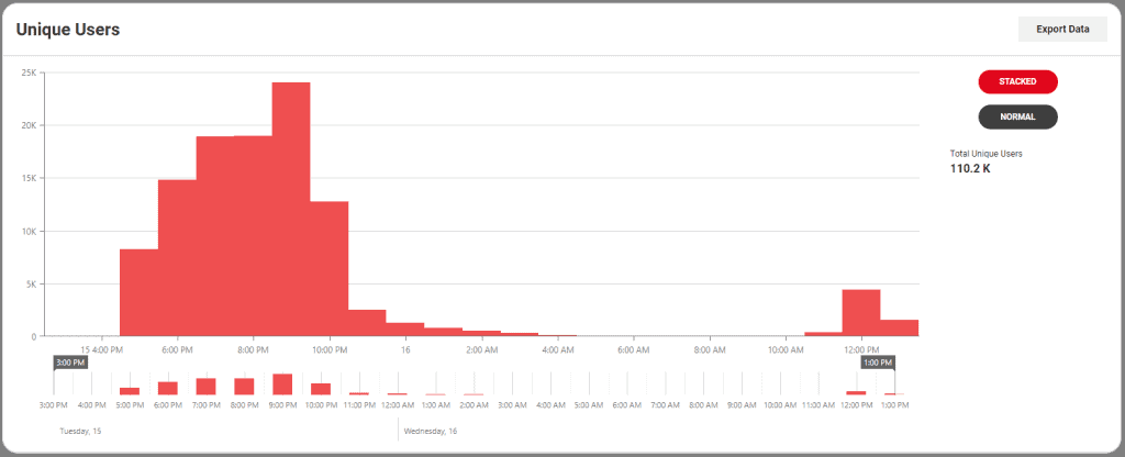
This graph shows unique users in the selected time frame. The legend on the right side gives you the total of unique users for that specific time frame. If you pass your mouse pointer over a bar, a tooltip will show up with some specific data relative to that very piece of graph. Unique users are populated every minute and they are calculated as: device + user-agent. You can find more information here.
Top Users
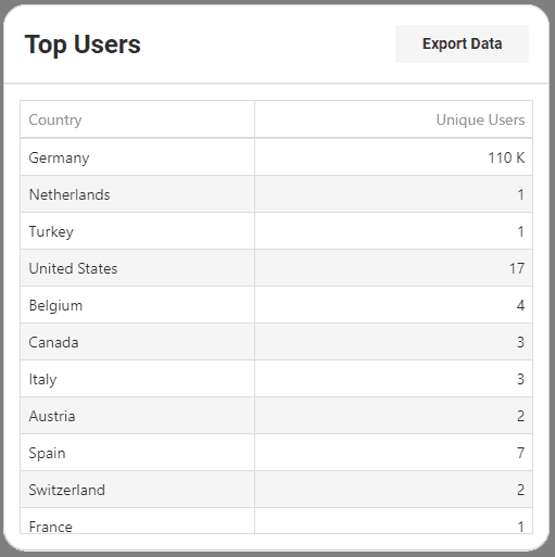
This table show cases the top countries from where users are accessing your content. Clicking on the columns title you can sort, ascending or descending, by Country and Unique Users. You are able to scroll vertically through the results as well.
Unique Users
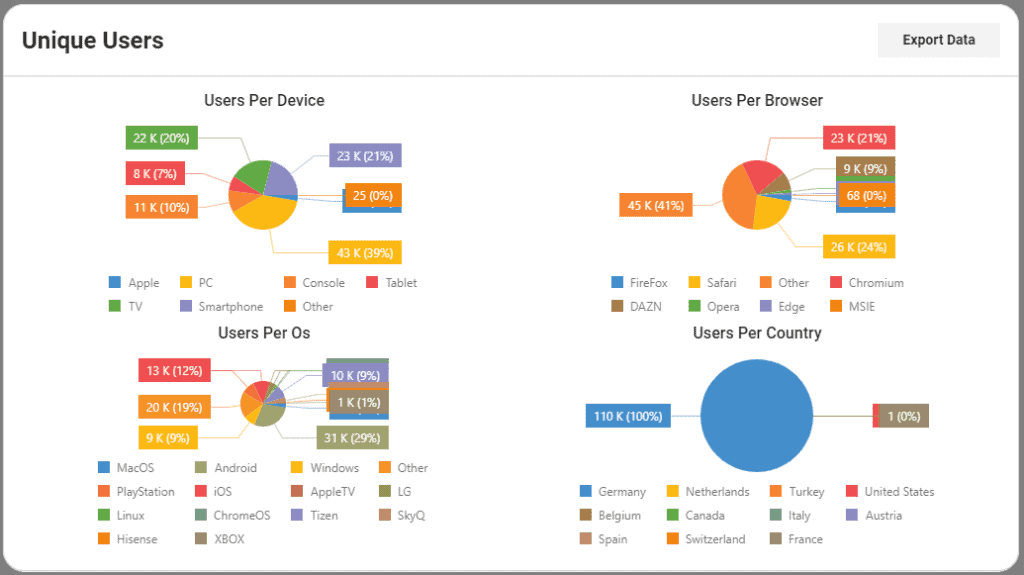
This graph shows a categorized view of Device, Browser, OS and Country on pie charts with the legend underneath every graph.
Geo
Unique Users
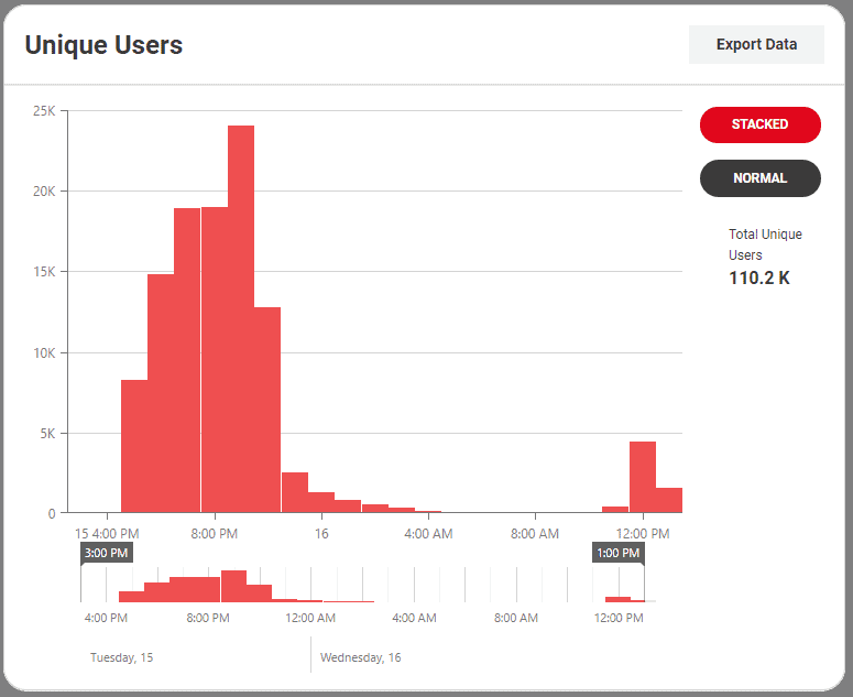
This graph shows unique users in the selected time frame. The legend on the right side gives you the total of unique users for that specific time frame. If you pass your mouse pointer over a bar, a tooltip will show up with some specific data relative to that very piece of graph. Unique users are populated every minute and they are calculated as: device + user-agent. You can find more information here.
Geo-distribution
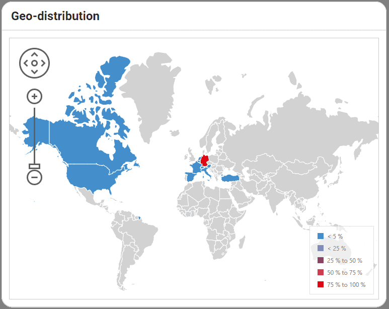
This data visualization shows you where the user are localized around the world. The legend box gives you the density percentage via colors. If you pass your mouse pointer over a country, a tooltip will show up with the country specific data. Also, you can use the pan and zoom controls on the left to focus on a specific area. Using the Export Data button, you’ll have the opportunity to have the total users per country inside the downloaded CSV file.
Country & ISP
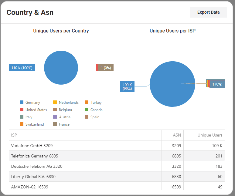
This measurement is split in two parts: – Pie charts: shows a categorized view of Unique Users per Country and Unique Users per ISP. – Table: shows the unique users aggregated by Internet Service Provider with associated Autonomous System Number. Clicking on the columns title you can sort, ascending or descending, by Country and Unique User. You are able to scroll vertically through the results as well.
Top Countries
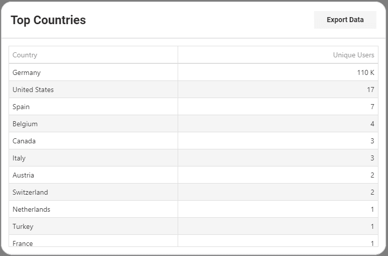
This table show cases the top countries from where users are accessing your content. Clicking on the columns title you can sort, ascending or descending, by Country and Unique Users. You are able to scroll vertically through the results as well.

